
One of the coolest things about code editors is how they can significantly enhance the interactivity of a site or blog. This makes them especially valuable for programming blogs and documentation/code samples. Instead of just using static code snippets, code editors with an output display or console can provide a much more engaging experience.
In this article, we will learn how to create an interactive code editor/playground using React and SandPack.
What is SandPack
CodeSandBox is one of the most popular cloud development environments out there. SandPack is the bundler that CodeSandbox uses for its environments. This ensures that SandPack is always up-to-date and patched.
SandPack is a component toolkit for building live code editors for your blogs and technical docs. In this article, we will focus on sandpack-react rather than sandpack-client, which is a lightweight JavaScript bundler. You can find SandPack in a bunch of popular docs and blogs, like these:
- The official React JS docs.
- Josh Comeau's blog
- Varun Vachhar’s blog
- The blog you are reading this on!
If you check out the examples above, you'll notice that all the editors look pretty different, even though they use the same library under the hood. What makes SandPack stand out is the wide range of customization options available. Plus, it's really easy to get started with. The most useful features of sandpack-react include:
- Pre-built templates for popular languages and frameworks
- A larger number of pre-built themes for the editor as well as the option to create custom themes.
- Support for all npm dependencies and major JavaScript frameworks.
- Options to customize the UI and almost every aspect of the playground.
- You can create a completely custom playground using the pre-build composable components.
- Providers and custom hooks are available to create custom components.
Overview of The PlayGround
To get started with sandpack-react, run this npm or yarn command:
npm i @codesandbox/sandpack-react
or
yarn add @codesandbox/sandpack-react
Next, import the Sandpack playground and render it using the following code:
import { Sandpack } from "@codesandbox/sandpack-react"; export default function App() { return <Sandpack /> }
The <Sandpack /> component sets up an empty playground for you to jump right in. By default, the playground contains a basic React template. Let's look at basic props to customize the templates, themes, and more:
- template: This property accepts a predefined list of templates. By default,
vanillais set. - files: This is a very useful property. You can create multiple files with custom code, similar to a regular folder structure. The
filesobject contains a value (the relative file path) and the key (file content). The files in this object are then automatically shown in the tabs as well. Additional props for each file,, such asreadOnlyandactive, are also present. - options: You can customize several features using the
optionsobject. You can view the full list here. Some of the most useful ones include:- showLineNumbers: Toggle the visibility of line numbers.
- showTabs: Toggle the visibility of the tabs.
- classes: You can assign custom class names to existing template classes for further customization.
- dependencies: The
dependenciesobject can contain any NPM package needed by the app. The format and syntax are similar to those of apackage.jsonfile. - theme: You can chose a pre-built theme or assign a completely custom theme. Learn more on how to build a custom theme here. Two themes, dark and light are available by default. The pre-built ones can be imported from
@codesandbox/sandpack-themes.
Customizing the PlayGround
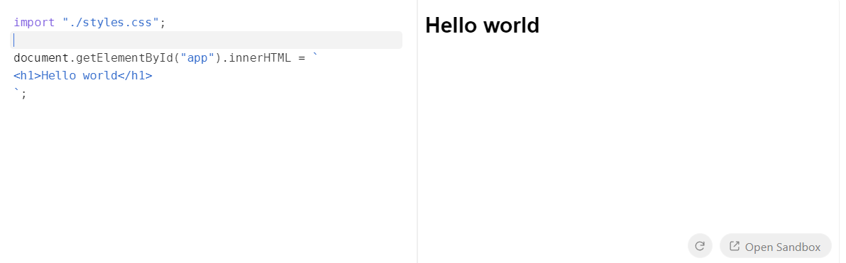
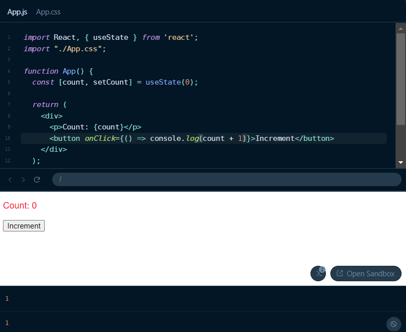
Let's tweak the default playground to fit our style and create a fun example to play around with. Customizing the editor to match your site theme can make it blend seamlessly and not feel like a third-party embed. First, let's use the files prop to create a simple counter button. Besides the App.js file, we'll also create the App.css file.
Have a look at the example and code below:
In this example, a counter component is rendered in the playground. The files object contains the code for both App.js and App.css. We've chosen a theme from the pre-built list mentioned earlier, sourced from sandpack-themes, adding a touch of style. Line numbers have been set to true as well.
Additionally, you can easily customize the layout of the playground. This can be done by either applying custom classes or utilizing the pre-built options that SandPack provides. For instance, you can use custom classes like this:
<Sandpack theme={theme} template="react" options={{ classes: { "sp-wrapper": "custom-wrapper", "sp-layout": "custom-layout", "sp-tab-button": "custom-tab", }, }} />
You can then tweak the appearance and layout using CSS, giving you much more control over the visual design.
Another useful feature is the ability to switch between different layout modes. SandPack offers three modes: preview, tests, and console. The default mode is preview, while the tests mode provides a suite for running tests and the console mode renders a terminal/console component instead of a preview window. The console mode is useful for displaying outputs of server side logic. You can also switch the layout direction using the rtl (Right to left layout) option.
Customizing the Output
Besides the editor itself, the output display can be customized as well. For instance, you can choose to show or hide the console, change the layout, or even modify the appearance of the preview window. Pretty cool right!. Code editors often have heavily customized editing windows, but the actual output is not paid attention to as much.
The console displays all sorts of errors and console logs. Depending on the type of code snippet being showcased, you'd either want to show or hide the console. You can also toggle the visibility of the show console button. By default, the console is hidden. As with all the SandPack components, the styling can be individually modified using custom CSS classes.
<Sandpack template="react" files={files} theme={nightOwl} options={{ showConsole: true, showConsoleButton: true, }} />;
Besides the console, the display window itself can be customized as well. For example, you can turn the navigator bar on or off with the showNavigator option and decide if you want the panels to be resizable with the resizablePanels option.
<Sandpack template="react" files={files} theme={nightOwl} options={{ showLineNumbers: true, showNavigator: true, resizablePanels: true, }} />
The result will look somewhat like this:
Advanced Usage
Pre-built options are great for getting started, however, they greatly limit the extent to which you can customize the playground. For more advanced use cases, SandPack allows you to fully customize the playground by using its prefixed components and hooks.
Components
Several SandPack-prefixed components are available within the sandpack-react package. These components allow you to build custom setups and layouts for your code editor. For example, instead of relying on the default presets, you can piece together your own playground using components like <SandpackCodeEditor>, <SandpackPreview>, and <SandpackConsole>. For example, the default playground can be made like this:
import { SandpackProvider, SandpackLayout, SandpackCodeEditor, SandpackPreview, } from "@codesandbox/sandpack-react"; export default () => ( <SandpackProvider template="react"> <SandpackLayout> <SandpackCodeEditor /> <SandpackPreview /> </SandpackLayout> </SandpackProvider> );
The best part about this is that you can create any sort of layout imaginable. For example, multiple preview windows, custom HTML elements like buttons within the playground and much more. The props and options discussed in previous sections are also all valid here.
Hooks
But what if you want to go even further and create your own components instead of using the ones that come with SandPack? That’s where hooks come in. Sandpack provides several hooks that allow you to access the sandpack context. Some of the most useful ones include:
useSandpackis the main hook that lets you access the entire context object. With the sandpack object, you can tap into all the internal states of any component and use methods likecloseFileto manipulate those states. Just remember, you can only use this hook inside theSandpackProvider. All the other hooks are built on top of this one.- The
useSandpackNavigationhook is useful for building a custom refresh button, for example. It provides us with the refresh function that acts as an action dispatcher and triggers a sandbox preview refresh. - You can get the
codevalue and anupdateCodecallback fromuseActiveCode. This is particularly useful if you want to use your own sytnax highlighter or code editor.
These hooks let you fully customize the sandbox. You can create cool features like fullscreen mode, auto-save, code formatting with tools like Prettier, and even use your own icons and graphics.
Let's create a simple example using the hooks discussed above. Let's say you want to create a custom refresh button that refreshes the preview and a custom code editing component. Here’s how you might implement it.
For the refresh button, we will use the useSandpackNavigation hook. The refresh function can then be attached to the button.
const RefreshButton = () => { const { refresh } = useSandpackNavigation(); return ( <button type="button" onClick={() => refresh()}> Refresh </button> ); }; return ( <SandpackProvider template="react"> <RefreshButton /> <SandpackCodeEditor /> {/* Hide the default refresh button */} <SandpackPreview showRefreshButton={false} /> </SandpackProvider> );
Next, we'll use the useActiveCode hook to get the code and use it in our own editor component. For this example, I will use the React Monaco code editor. We'll pass the code via the value prop and update it with the updateCode callback in the onChange event. You can learn more about it here.
const CustomEditor = () => { const { code, updateCode } = useActiveCode(); return ( <Editor height="100px" language="javascript" theme="vs-dark" value={code} onChange={updateCode} /> ); };
You can view the demo and complete code below:
Keep in mind that the layout is the same one we discussed earlier. The only difference is that we're using a custom refresh button alongside our own code editor. Other than that, the core functionality of the playground remains the same.
Conclusion
Sandpack isn't just easy to use—it's also super customizable. This makes it a great choice for blogs, documentation, or any platform where live code editing adds value, while still allowing developers to customize it based on their sites.